+
Client
Honest Co.
Project Scope
Brand Redesign
Brand Essense
Conscious. Everyday. Honest.
Brand Story
The Honest Company was founded in 2012 out of a need for safe, non-toxic baby products. Built on transparency, sustainability and ethical consumerism, the brand follows “The Honest Standard,” ensuring products are safe for families and kind to the planet. Starting with diapers and wipes, it has since expanded into skincare, household and beauty products, turning conscious living into a movement for healthier homes and a healthier world.
+
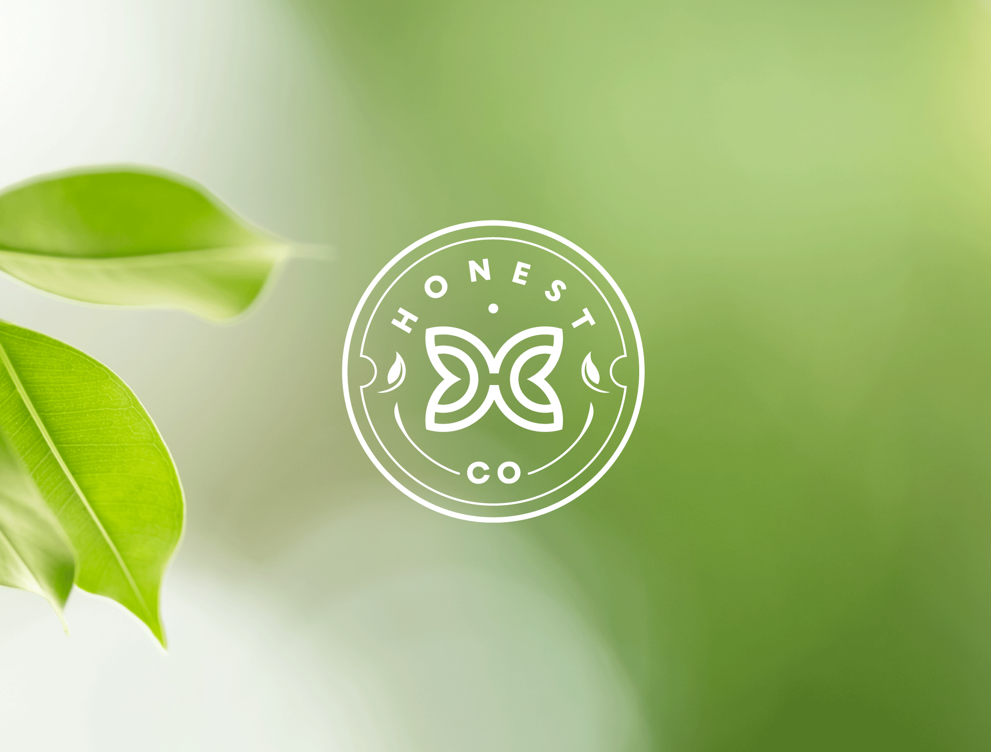
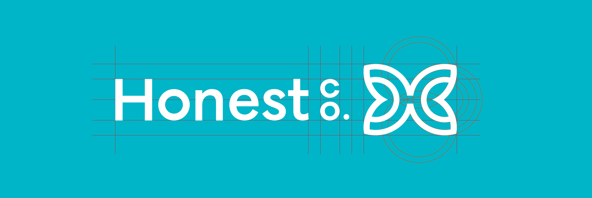
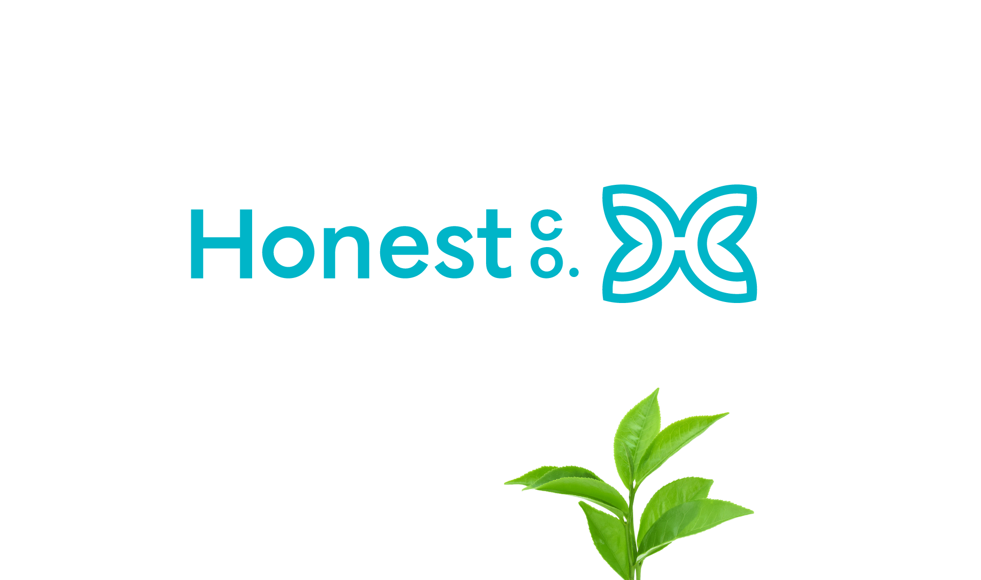
Symbolism
The emblem’s circular shape gives it a universally recognizable, iconic presence while representing the world and the brand’s care for families and the planet. The monogram “H” transforms into a butterfly, symbolizing growth, transformation and gentle care which defines every product. Paired with clean, modern typography, the identity balances warmth and approachability with clarity, creating a user-friendly, legible mark across digital and physical touchpoints.
+
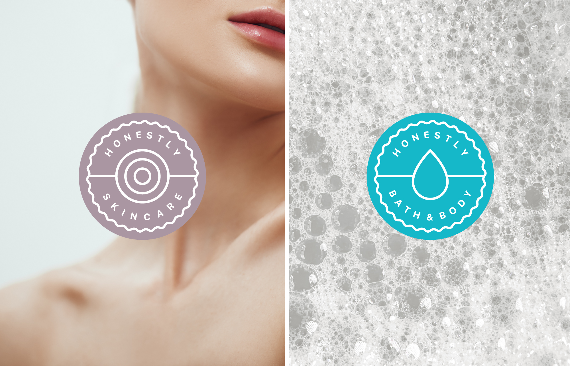
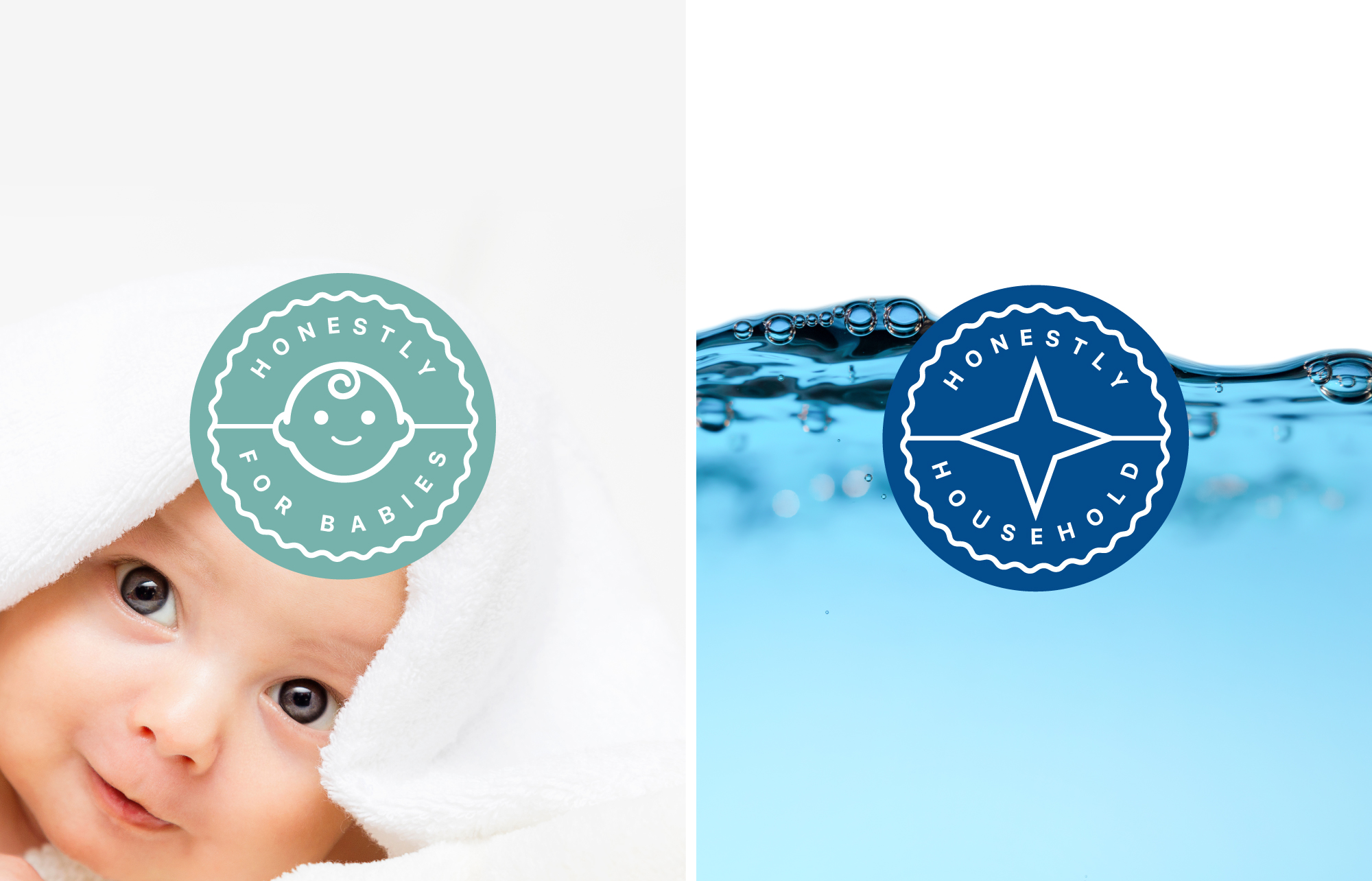
Color Psychology
The primary blue conveys trust, reliability and safety, which are core values of the brand. Earth-derived tones are used across labels to create a clear visual system that distinguishes and differentiates product lines, including skincare, bath and body, baby and household essentials.
This palette supports a cohesive visual hierarchy that evokes calm, natural and eco-conscious associations, reinforcing the brand’s commitment to sustainable living and facilitating intuitive product recognition.
+
Brand Concept and System
The logo and design system embody the brand’s philosophy of organic, safe and sustainable products for modern families. Its clean, simple forms ensure recognition and clarity at any scale while strategic visual cues allow each product line, to be distinct yet unified. This approach ensures intuitive navigation and seamless recognition across touchpoints, enhancing the user experience and reinforcing brand trust.

+
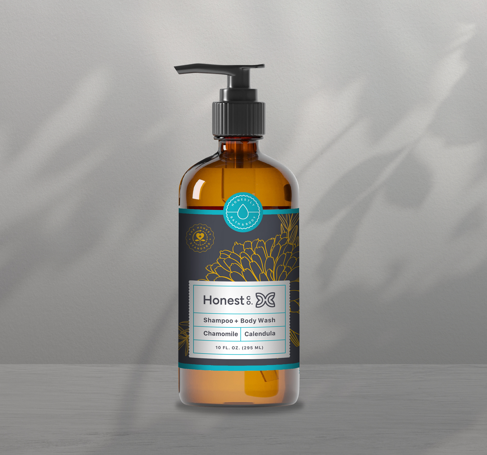
Labels
Designed to visually differentiate product lines including skincare, bath and body, baby care and household essentials so users can quickly identify options and choose the right one with confidence.
+
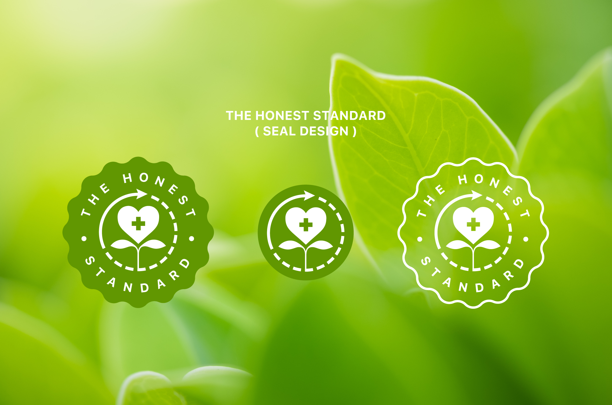
The Honest Standard
Icon representing the Honest philosophy of safe, sustainable and naturally derived ingredients backed by science.