+
Client
OutHir
Project Scope
Brand Development
Brand Essense
Wear True. Stand Out.
Brand Story
OutHir was born from a simple truth: the most rewarding terrain is the one discovered within. The brand builds more than clothing. It creates anchors for the modern nomad. Inspired by the resilience of the natural world, the line is designed for those who value bravery over trends and authenticity over noise.
+
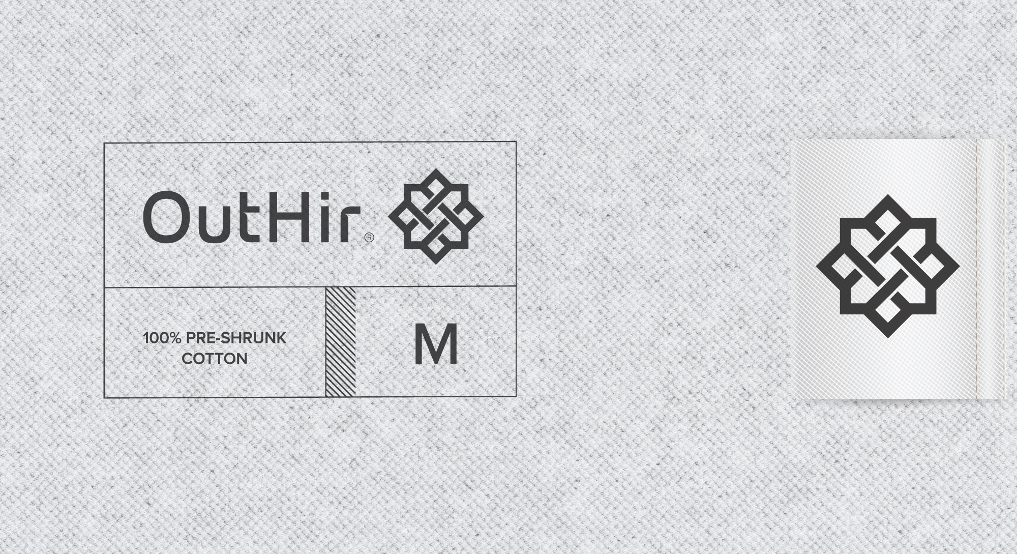
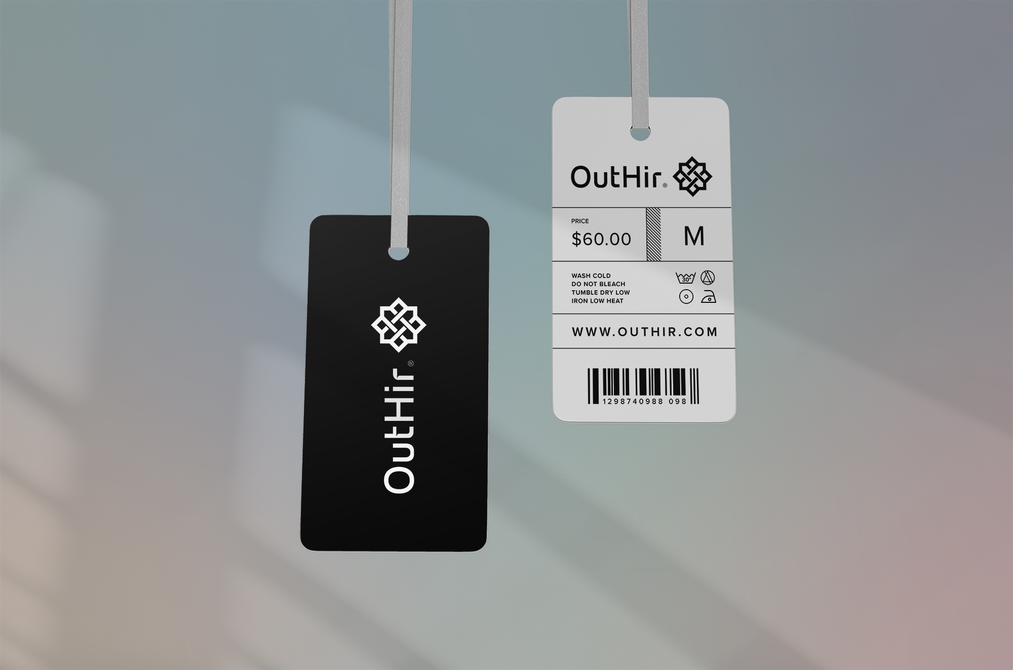
Symbolism
OutHir’s identity is woven into a signature O/H monogram, representing a visual tapestry of interconnected experiences. The star-shaped ‘O’ aligned with ‘H’ forms the North Star.
As a symbol of constancy, hope and direction, the mark serves as a silent guide for the modern explorer. It reminds the wearer to follow their internal compass with resilience and unyielding purpose.
+
Color Psychology
OutHir is defined by a commitment to Black. Chosen for its versatility and permanence, the color serves a dual purpose: practical utility and symbolic depth. It represents the strength, sophistication and focus required to navigate life’s adventures. In a world of fleeting trends, black remains the ultimate grounding force reflecting the bravery of staying true to oneself.
+
Brand Concept
OutHir is more than a label. It is a reflection for purposeful living. Every garment is an exercise in intention, honoring the natural world through disciplined design and production choices. By threading together courage and freedom, OutHir equips the modern explorer to shine bravely and navigate the journey on their own terms.