+
Client
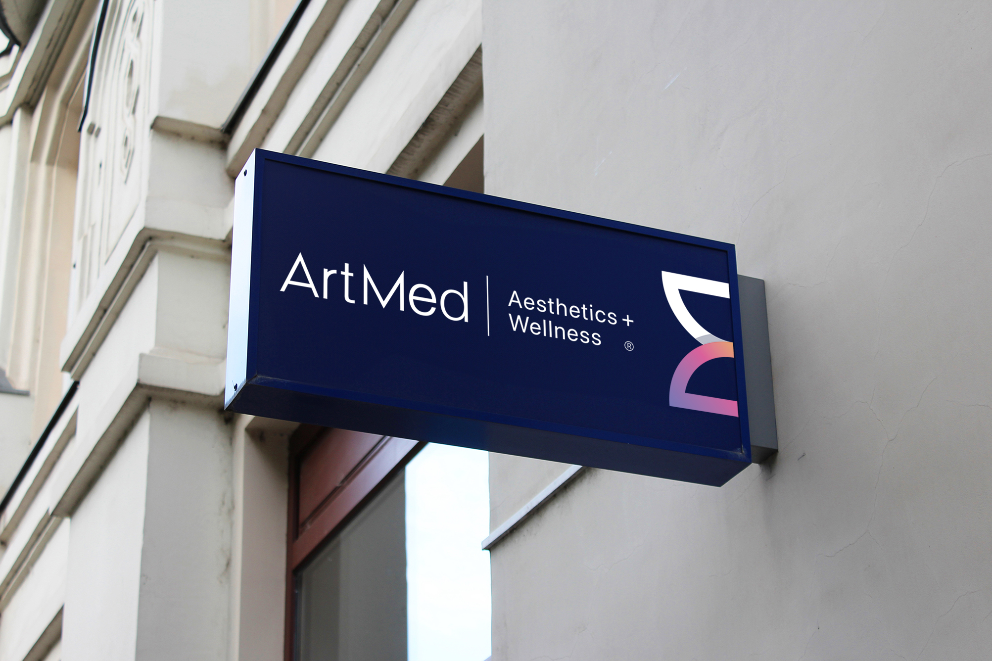
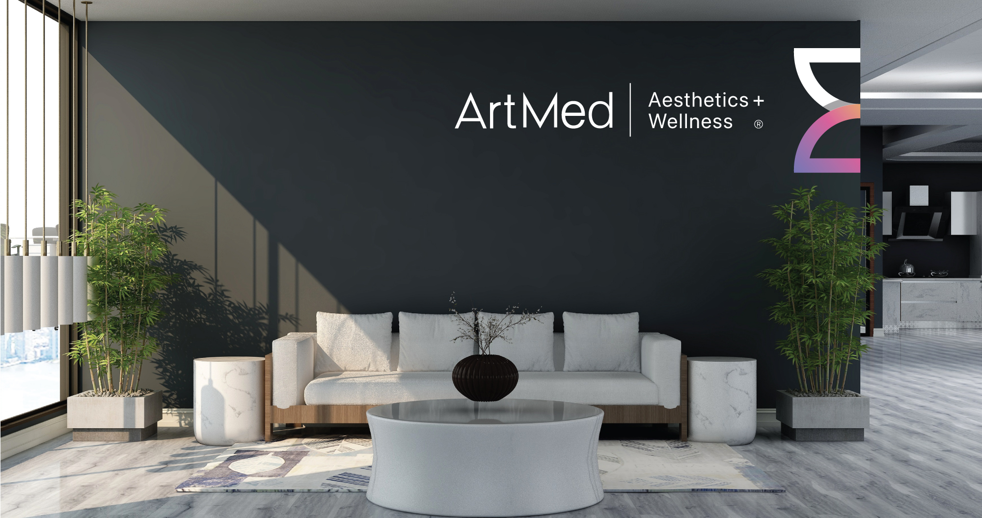
ArtMed Aesthetics and Wellness
Project Scope
Brand Development
Brand Essense
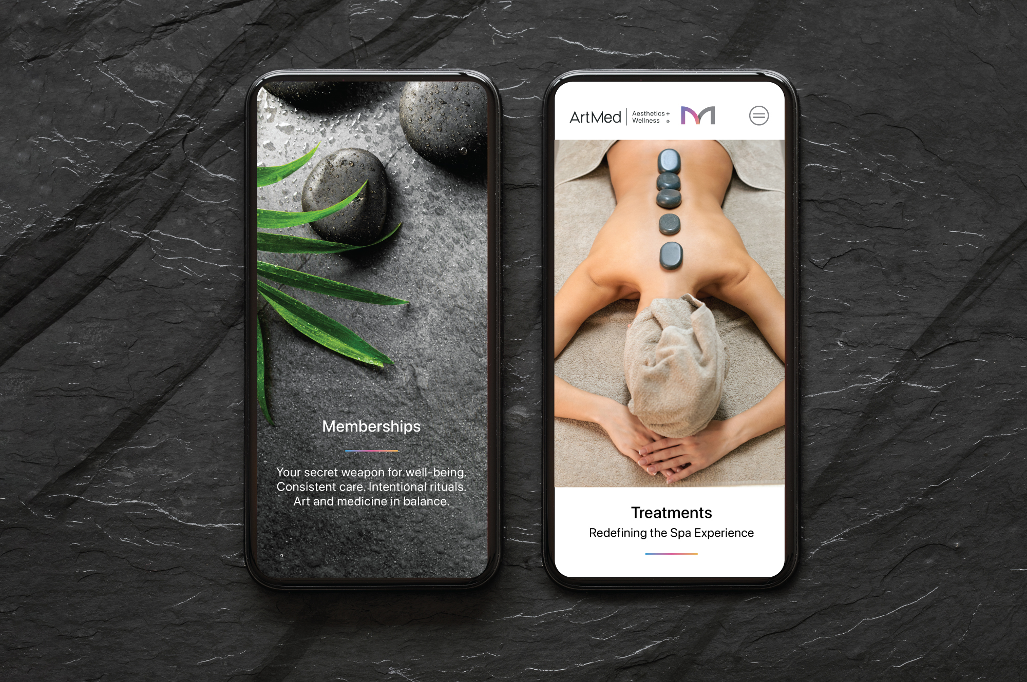
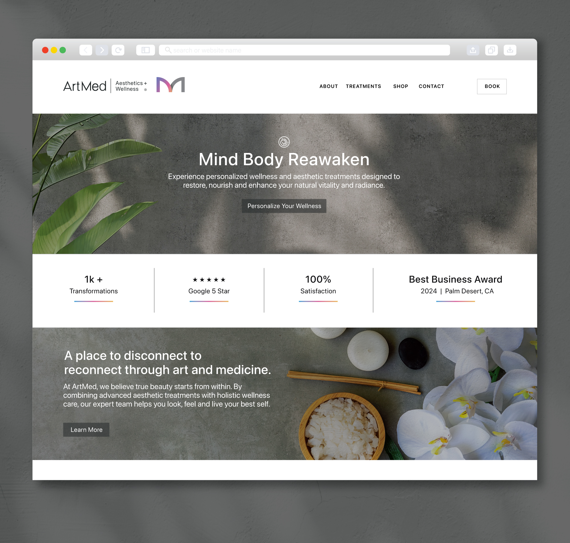
Mind Body Reawaken
Brand Story
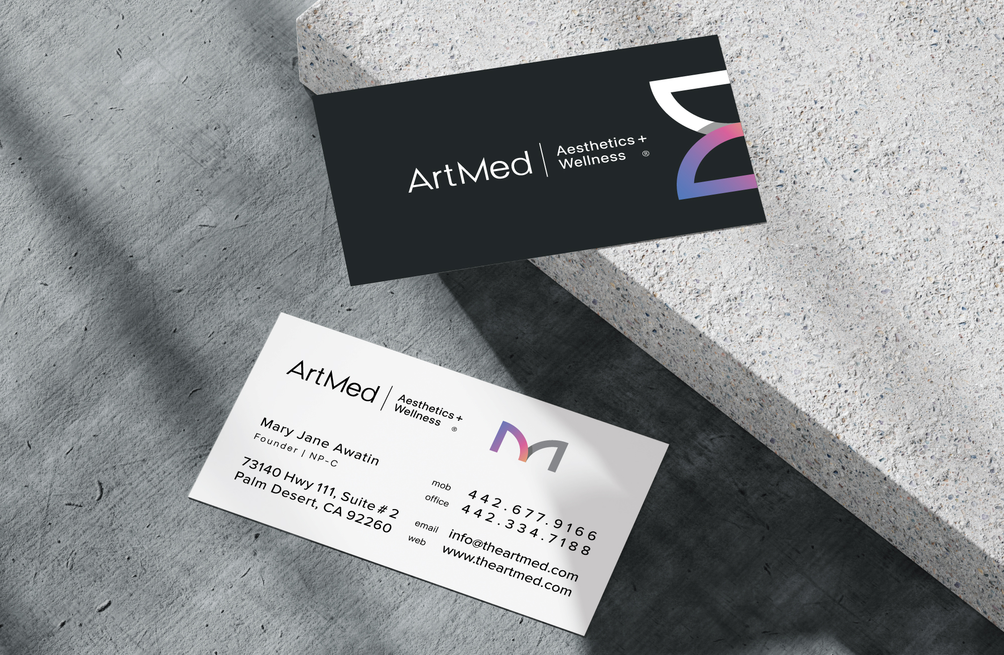
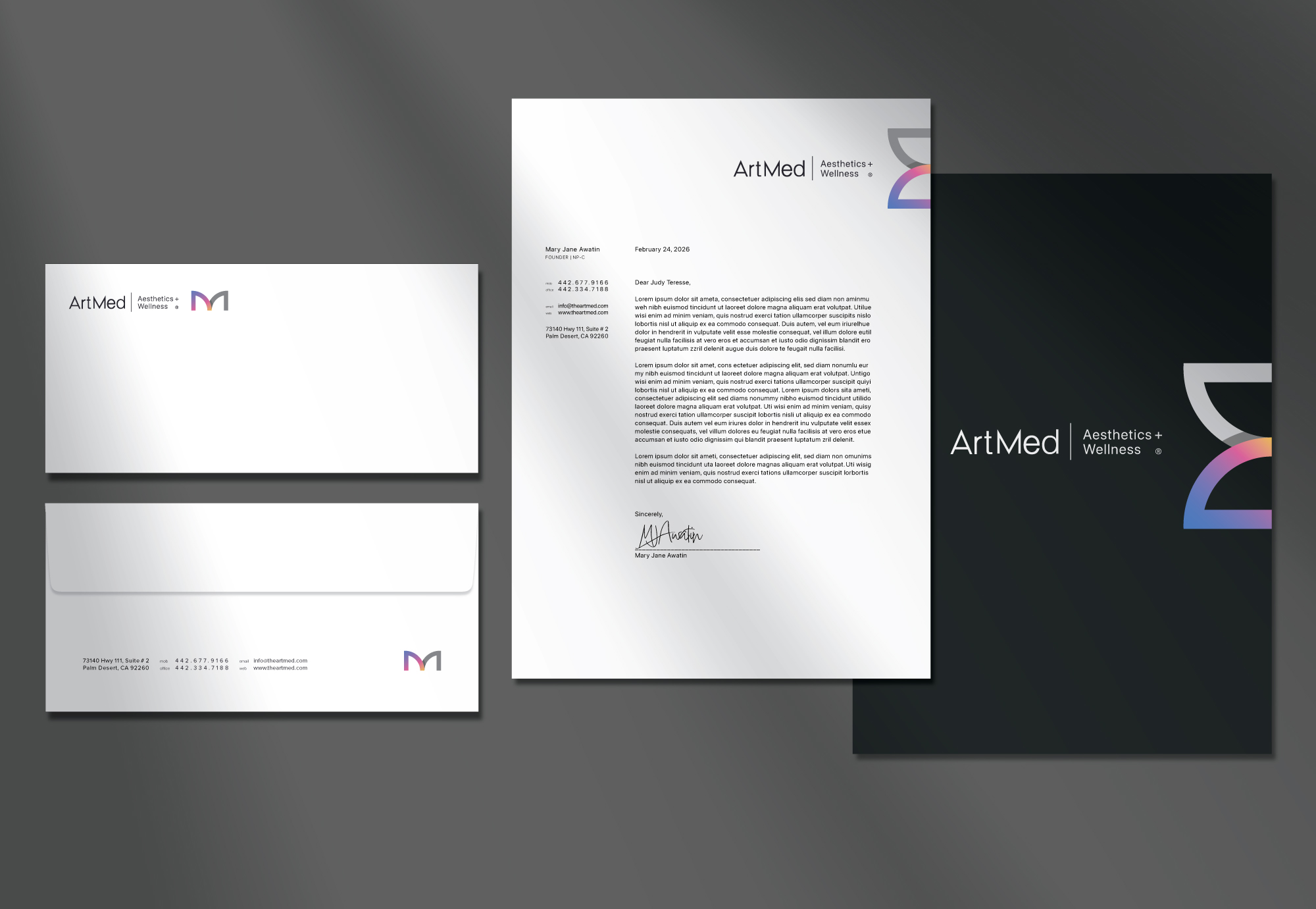
ArtMed Aesthetics and Wellness blends art and medicine to create a holistic, intuitive experience. The brand reflects timeless beauty, minimalism and quiet confidence guiding the body and mind on a transformative journey of wellness.
+
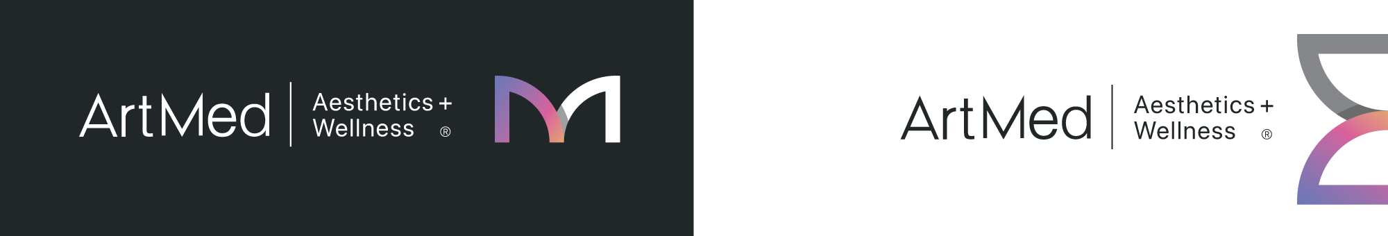
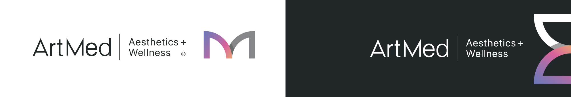
Symbolism
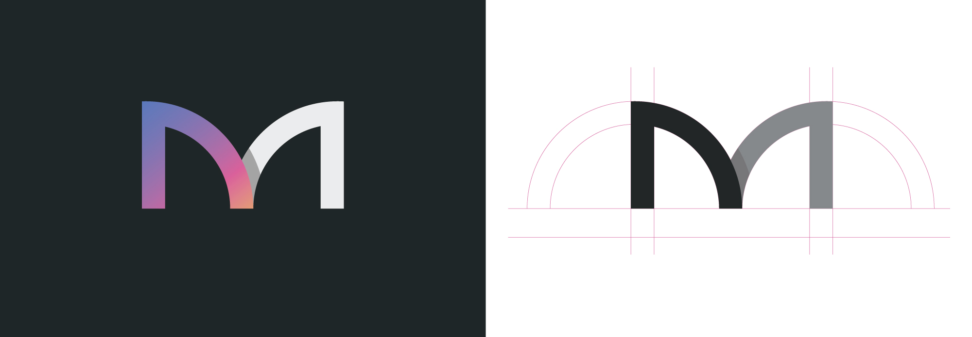
The logo centers around a custom-rendered “M”, designed to represent the initials A/M within a single form. This subtle construction reinforces unity and harmony, reflecting the seamless relationship between art and medicine.
The arch serves as the core metaphor, merging architectural strength with the organic grace of the feminine silhouette and facial features. It symbolizes stability, passage, transition and transformation, reflecting ArtMed’s balance of clinical precision and timeless elegance.
+
Color Psychology
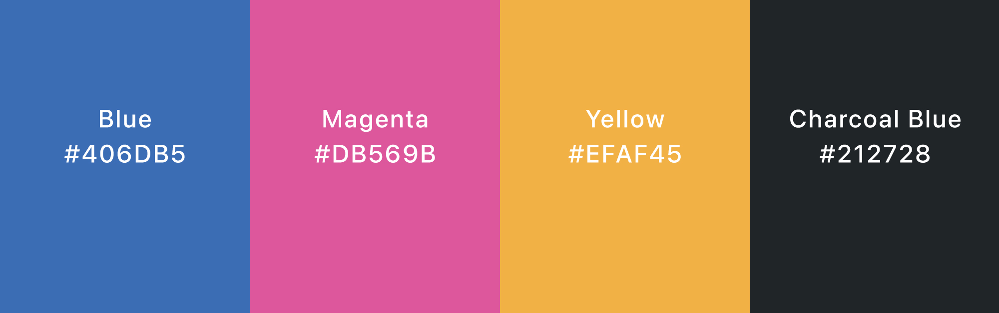
The logo uses blue, magenta, yellow, and black, a versatile CMYK-inspired palette that supports a wide spectrum of harmonious hues across digital and print. Beyond technical flexibility, these colors reflect the brand’s wellness and beauty positioning: calming blue evokes trust, vibrant magenta brings energy, warm yellow conveys optimism and black adds elegance. Together, the palette feels fresh, youthful and approachable, creating a cohesive, adaptable identity across multiple touchpoints.
+
Brand Concept
ArtMed Aesthetics and Wellness was founded to harmonize clinical precision with artistic intuition. The concept centers on the “Aesthetic Arch,” a metaphor for the company’s mission to provide the structural foundation (medicine) necessary for natural, organic grace (art) to thrive. By bridging these two worlds, the brand creates a sophisticated space where medical expertise supports a holistic, transformative journey of quiet confidence.