+
Client
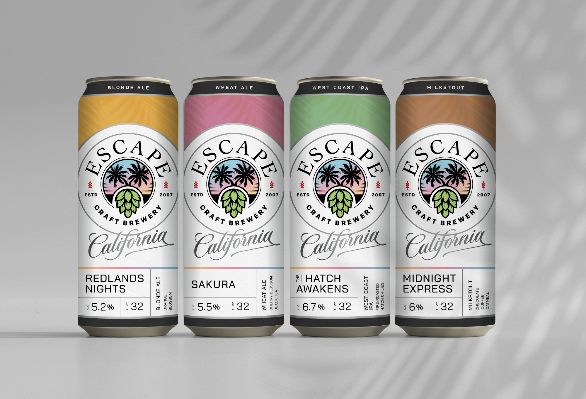
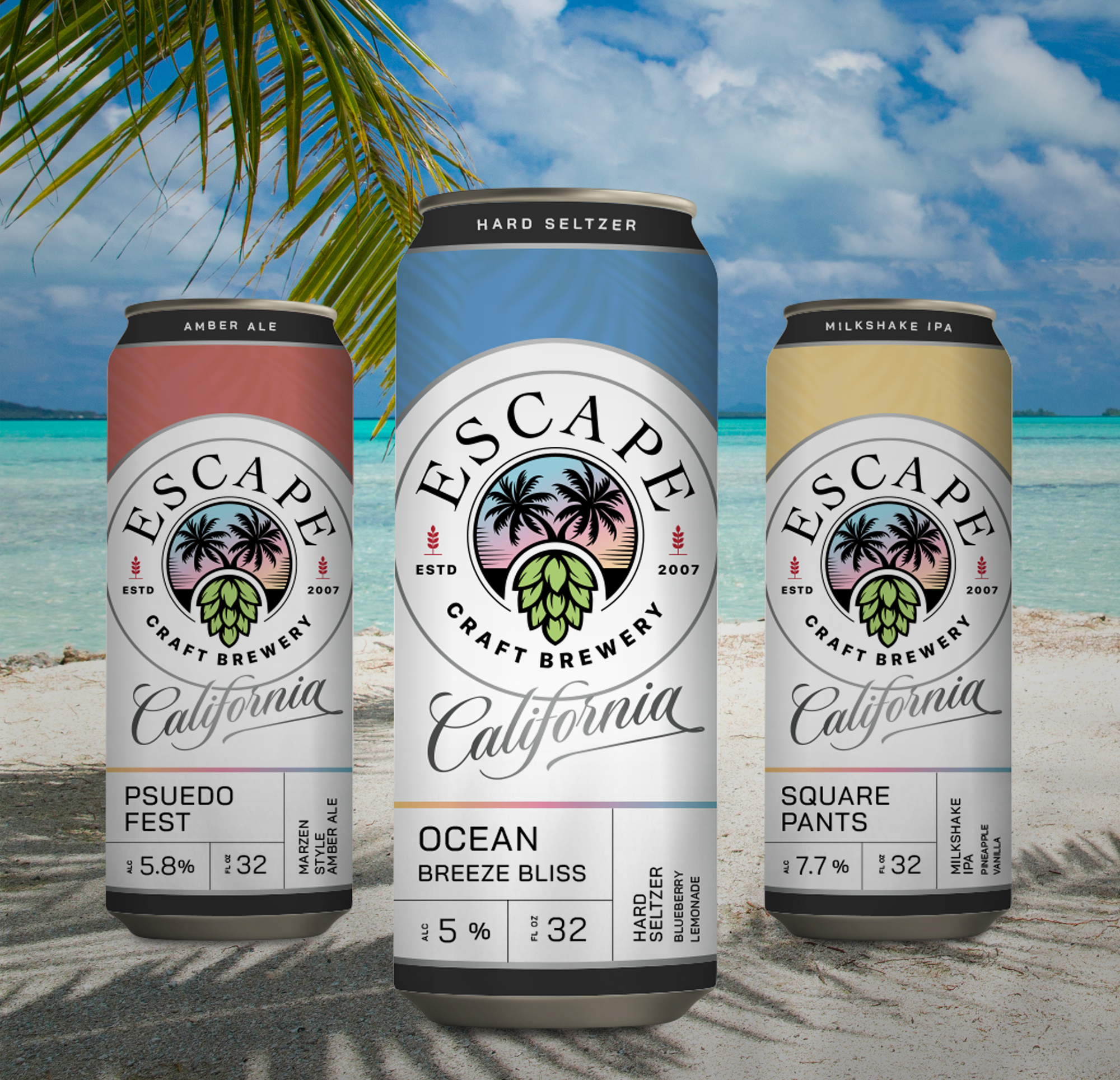
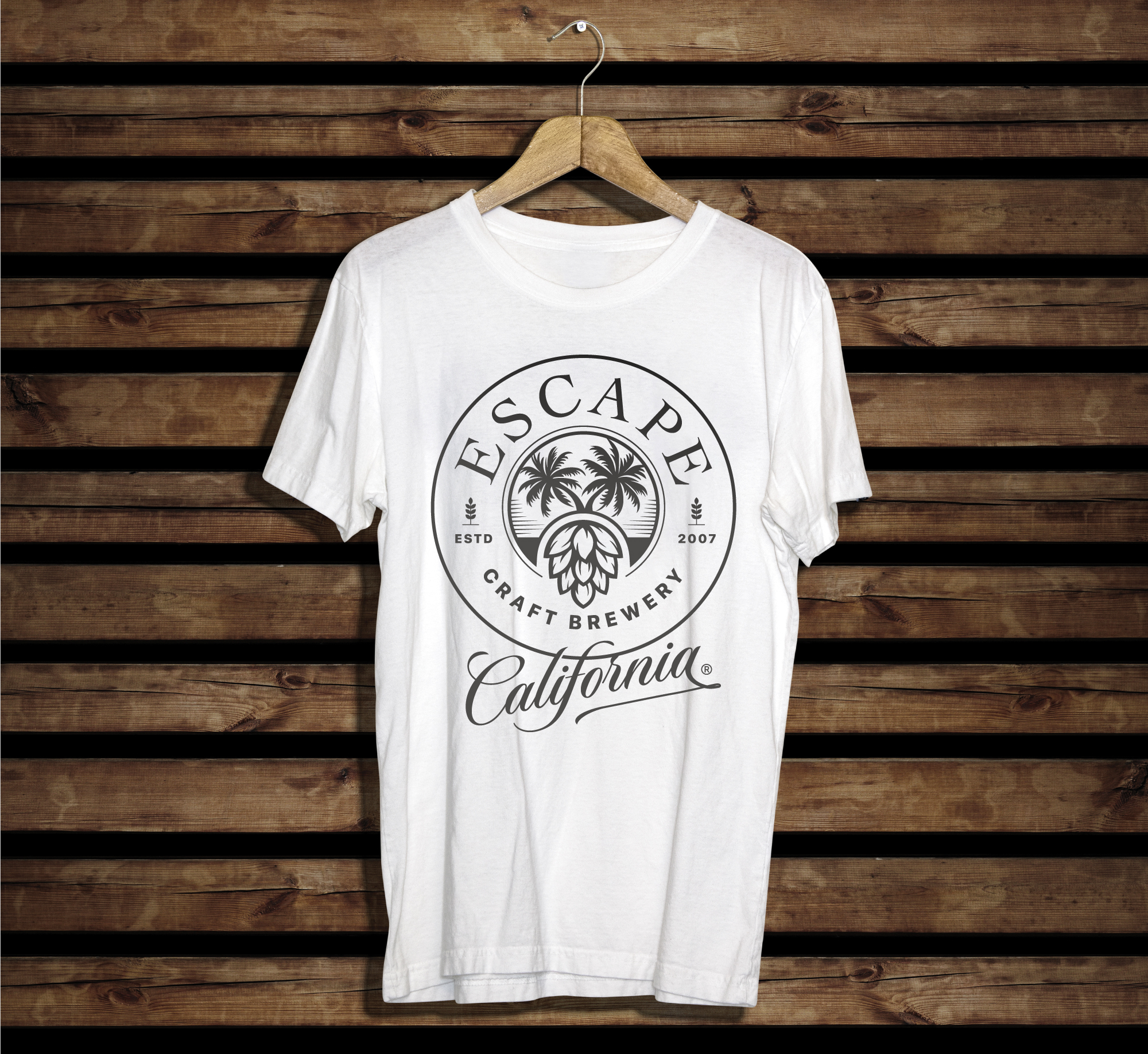
Escape Craft Brewery
Project Scope
Brand Redesign
Brand Essence
Savor the Craft. Escape the Ordinary.
Brand Story
Escape Craft Brewery was born from a desire to escape the daily grind and create a welcoming space for quality, thoughtfully crafted beer. Rooted in travel, creativity and community, Escape blends brewing tradition with a modern spirit of exploration, crafting innovative beers that bring people together.
+
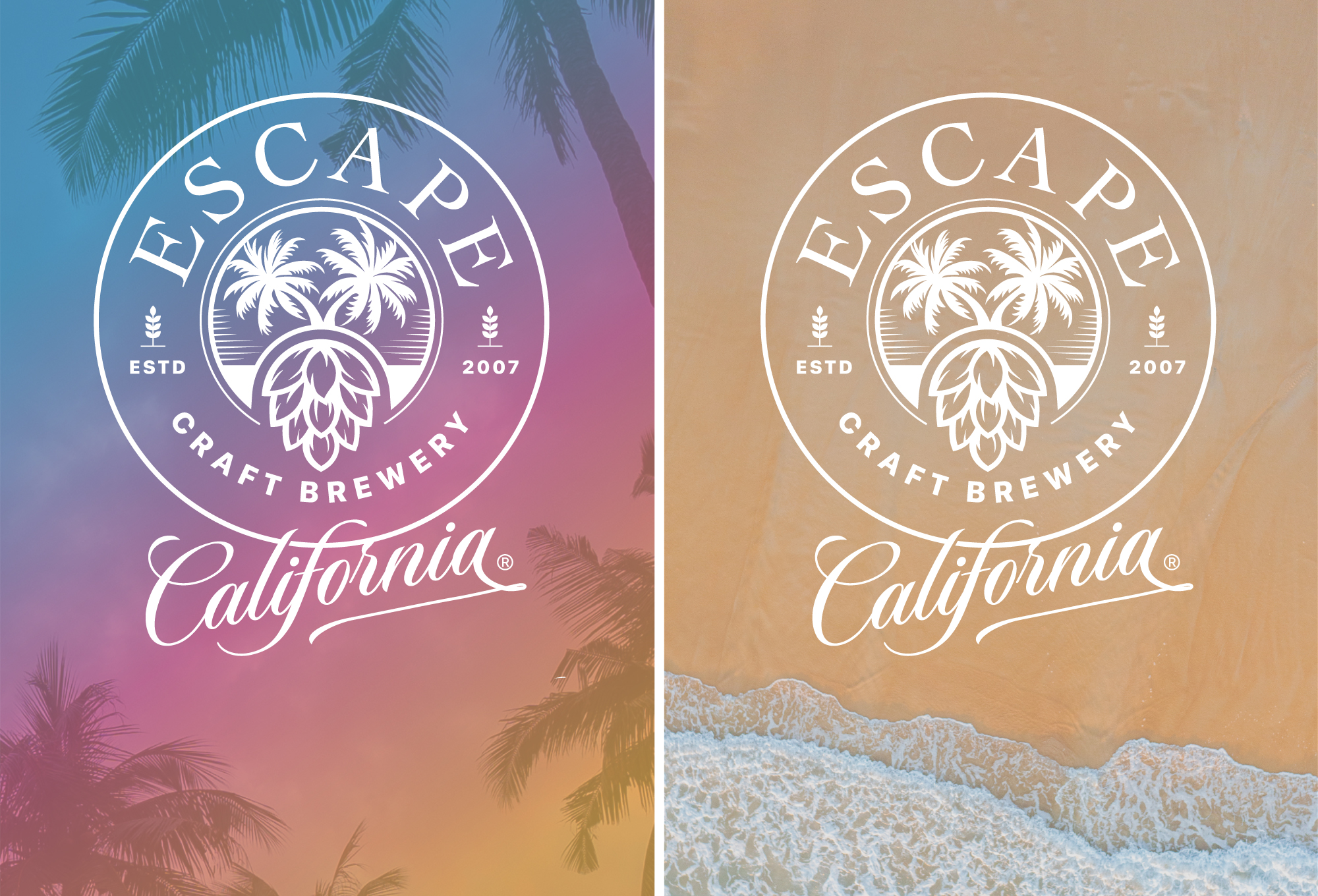
Symbolism
The logo illustration merges palm trees and a hop into a visual “island destination”, symbolizing the fusion of craft brewing and lifestyle. This reflects Escape Craft Brewery’s philosophy of adventure and relaxation. The hand-lettered “California” anchors the brand in its origin, emphasizing authenticity, local pride and artisanal craftsmanship.
+
Color Psychology
The color palette draws inspiration from the calm, atmospheric hues of sunsets reflecting the unique spirit of Escape Craft Brewery, where laid-back island energy meets contemporary craft culture.
+
Brand Concept
Escape Craft Brewery’s identity creates a refined yet relaxed brand, inviting consumers to slow down, escape the ordinary and savor every blissful sip of craft beer artistry. Every element from visual symbolism to the sunset-inspired color palette reinforces an experience of discovery, leisure and connection, seamlessly blending tradition with modern creativity.