+
Client
Porto’s Bakery and Café
Project Scope
Brand Redesign
Brand Essence
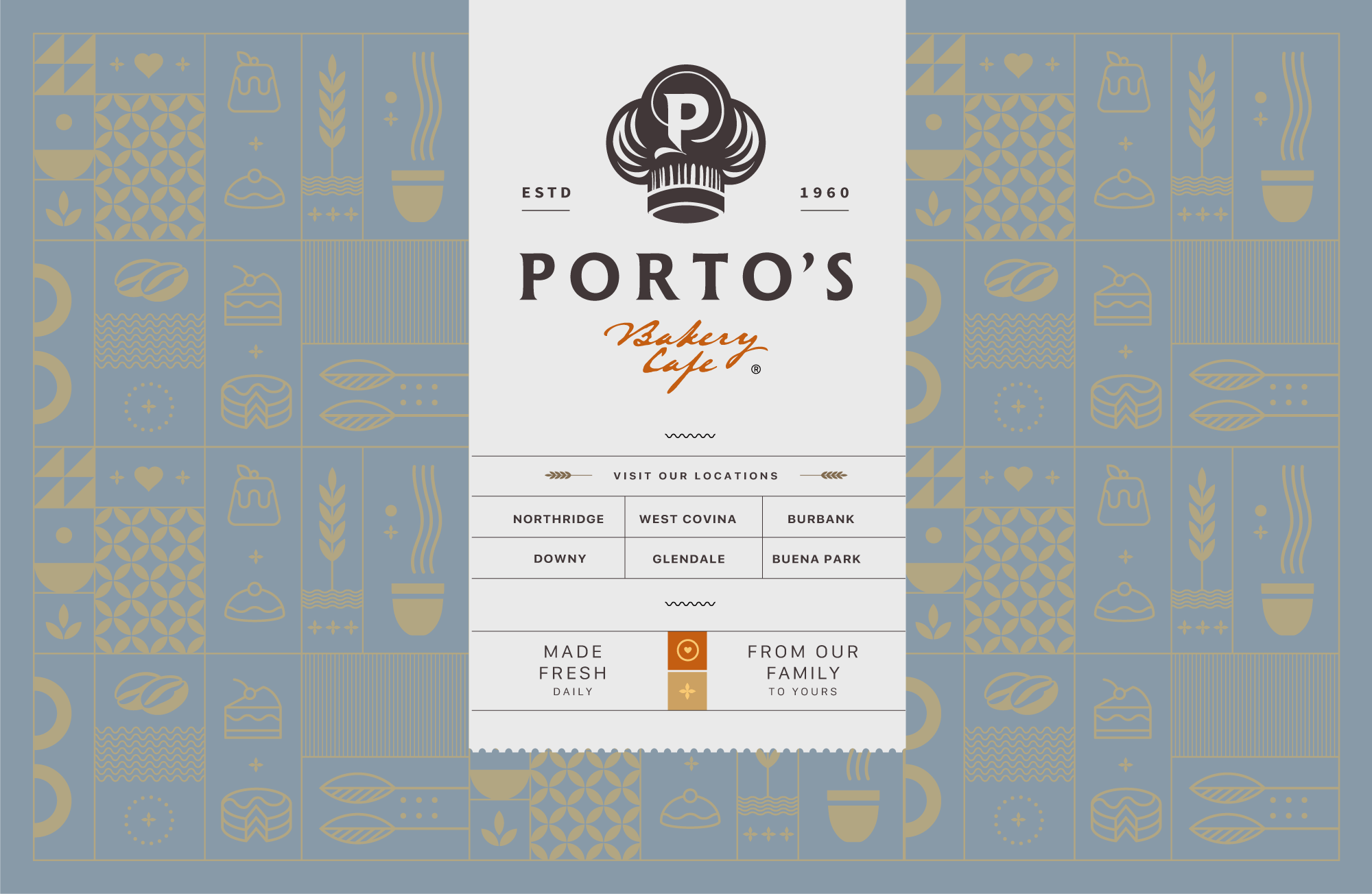
Quality. The main ingredient in everything we do.
Brand Story
From a home kitchen in Cuba to an iconic Southern California institution, Porto’s Bakery & Café is rooted in family, tradition and quality.
This rebrand builds upon the existing identity, refining it into a more cohesive and iconic system for a contemporary audience.
+
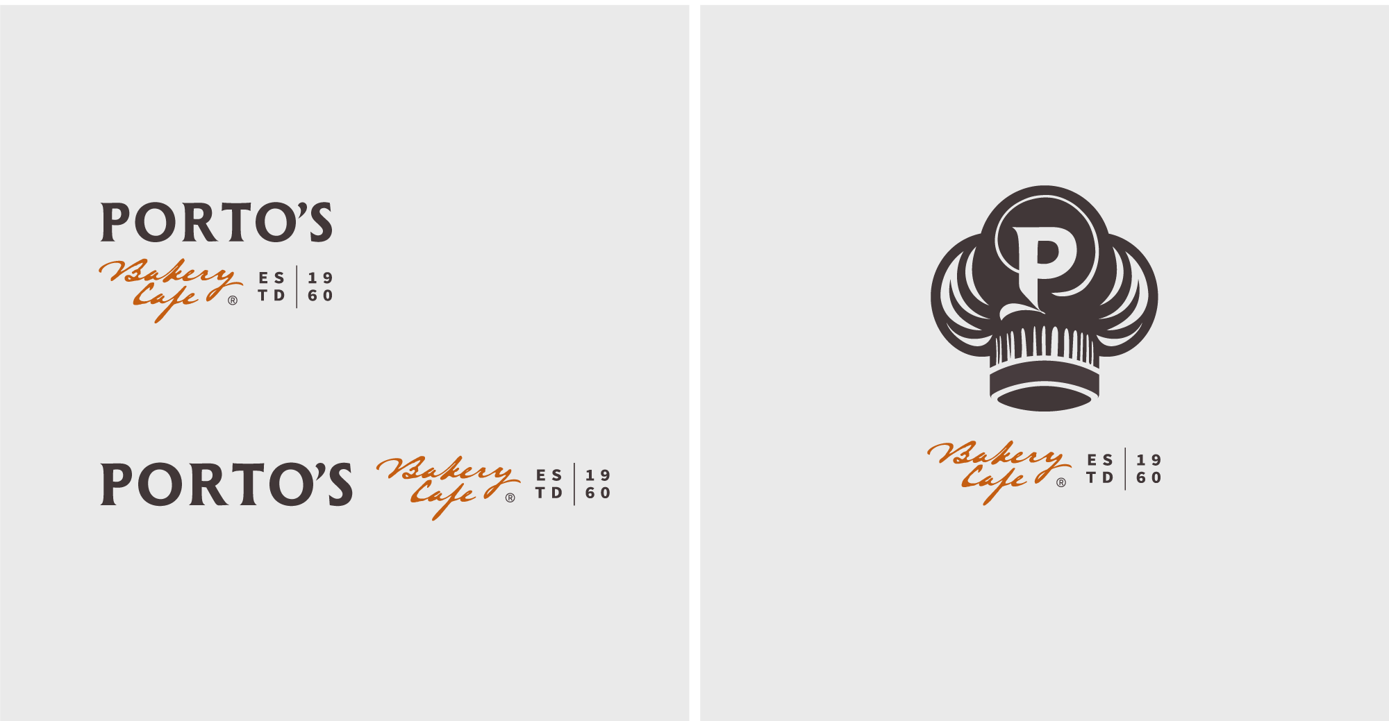
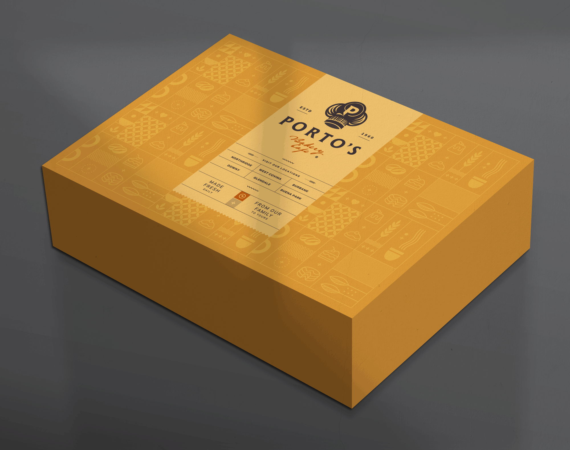
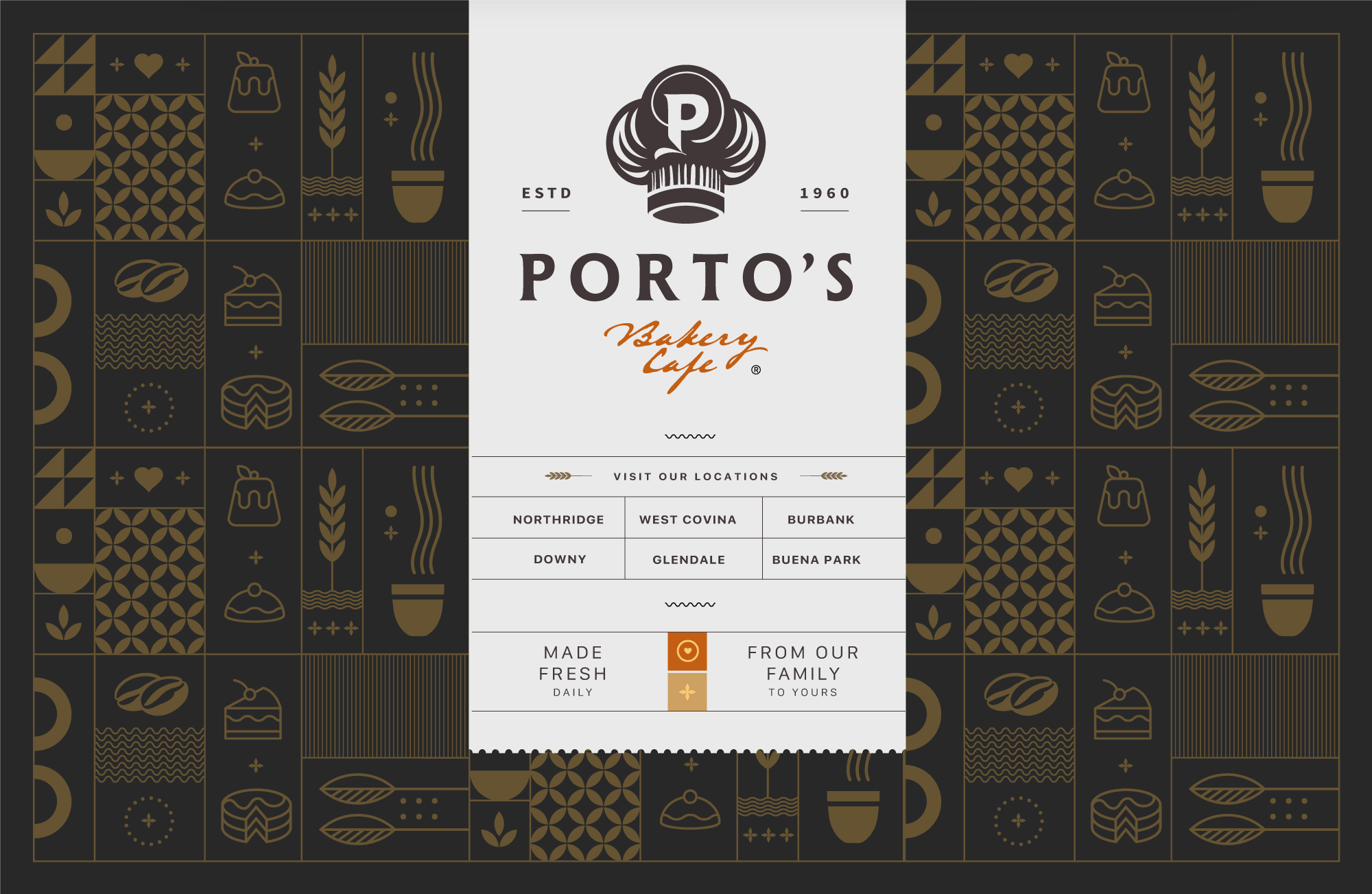
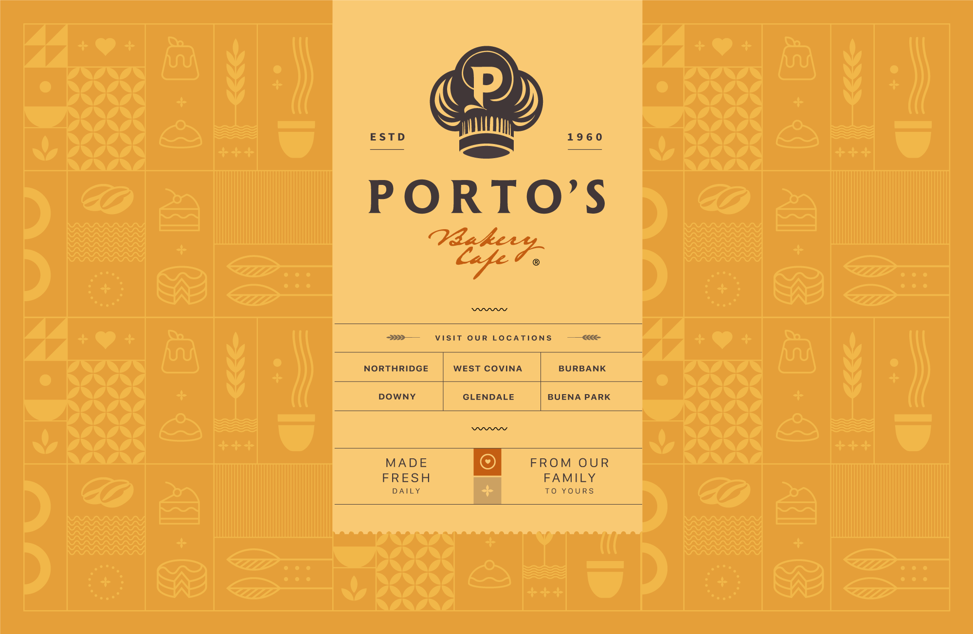
Symbolism
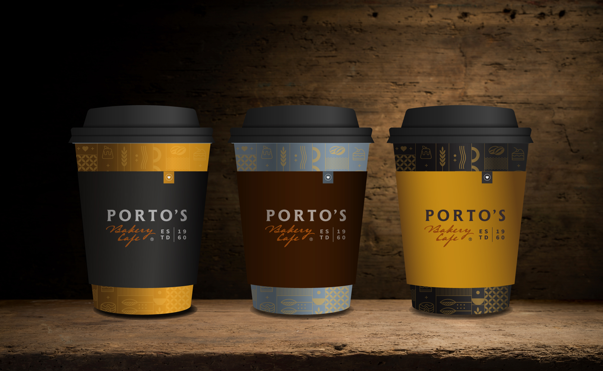
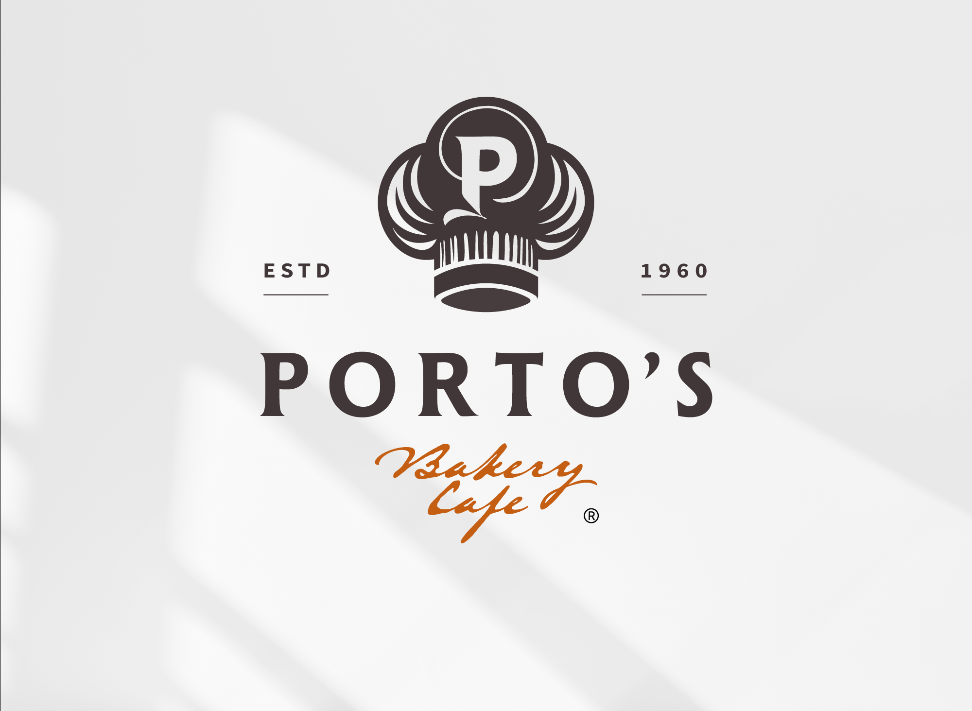
The redesigned logo features a chef’s hat with a “P” monogram, serving as a visual anchor, honoring Rosa Porto and the kitchen where traditions began. The serif typeface blends modernity with rustic charm, while the established date reinforces heritage. The calligraphic “Bakery & Café” adds a warm, handcrafted touch, embodying the familiarity and artisanal spirit that’s define Porto’s. Its engraved, time-etched quality bridges past and present, conveying authenticity and a lasting legacy. The balanced construction reflects the care behind every baked good.
+
Color Psychology
The color palette pairs espresso with copper, inspired by the natural richness of cacao, caramel, mocha, coffee, whole grains and freshly baked goods. These earth-driven tones convey tradition, honesty and craftsmanship while expressing warmth and approachability. Espresso (brown) is associated with stability, reliability and comfort, while burnt orange (copper) adds energy and friendliness. Together, the colors are welcoming, creating an inviting atmosphere where guests feel right at home.
+
Brand Concept
Porto’s brand identity embodies quality, warmth, artistry and longevity. Deeply rooted in tradition, the brand also embraces a modern approach evolving and innovating recipes over time. From our family to yours, Porto’s conveys comfort, welcome and approachability. As a trusted, artisanal bakery, the logo captures these qualities in a contemporary, timeless and iconic design.